Loading video…

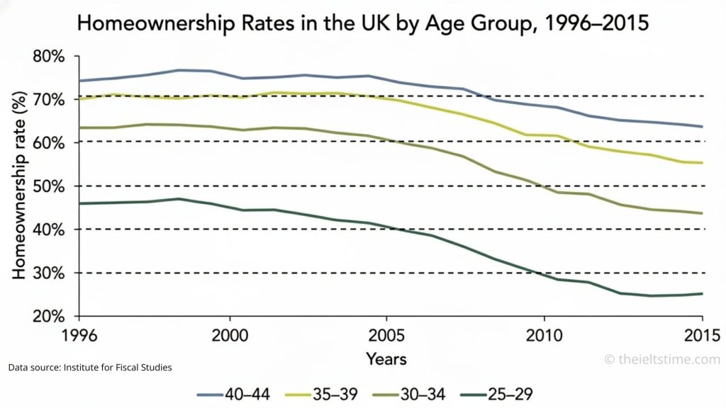
The line graph illustrates how homeownership levels changed among four age groups of UK adults between 1996 and 2015.
Overall, homeownership fell in every age category over the period, with the steepest declines occurring among younger adults. Throughout the timeframe, people in their forties consistently had the highest likelihood of owning a home.
In 1996, the two oldest groups—those aged 35–39 and 40–44—had the greatest proportions of homeowners, at approximately 70% and 74% respectively. These figures remained relatively stable until the early 2000s, after which both groups experienced gradual declines, reaching around 55% and 63% by 2015.
By contrast, ownership among younger adults decreased far more dramatically. Roughly 63% of 30–34-year-olds owned a property at the start of the period, but this proportion dropped steadily to about 44% by the end. The most pronounced fall occurred among people aged 25–29: their homeownership rate almost halved, falling from around 46% in 1996 to just 25% in 2015, making them the least likely group to own a home.
Leave a Reply